

Network Growth vs 52% Industry Average

Site Feasibility vs 30% Market Average

Planned Infrastructure Investment by 2030
Trusted by industry leaders











No More Guesswork

With over fifty data sources, our platform rapidly identifies relevant locations in a single simple screen, putting all the feasible sites at your fingertips.

Should you invest?
Just because you can, should you? With a few clicks, our proprietary AI-driven model provides instant return-on-investment insight so you can confidently invest in viable sites.

Where do you start?
You've identified the opportunity to invest, but which sites do you pick first? Our platform automatically prioritizes the best-performing sites based on your strategy.
vs 52% industry average
vs 30% market average
by 2030

new chargers in 2023
New Research
- 3 business approaches for CPOs
- 8 success factors for EV charger locations
- 10 must-have capabilities in a CPP platform


With over fifty data sources, our platform rapidly identifies relevant locations in a single simple screen, putting all the feasible sites at your fingertips.

AI-Powered
Just because you can, should you? With a few clicks, our proprietary AI-driven model provides instant return-on-investment insight so you can confidently invest in viable sites.

Easy to use
You've identified the opportunity to invest, but which sites do you pick first? Our platform automatically prioritizes the best-performing sites based on your strategy.
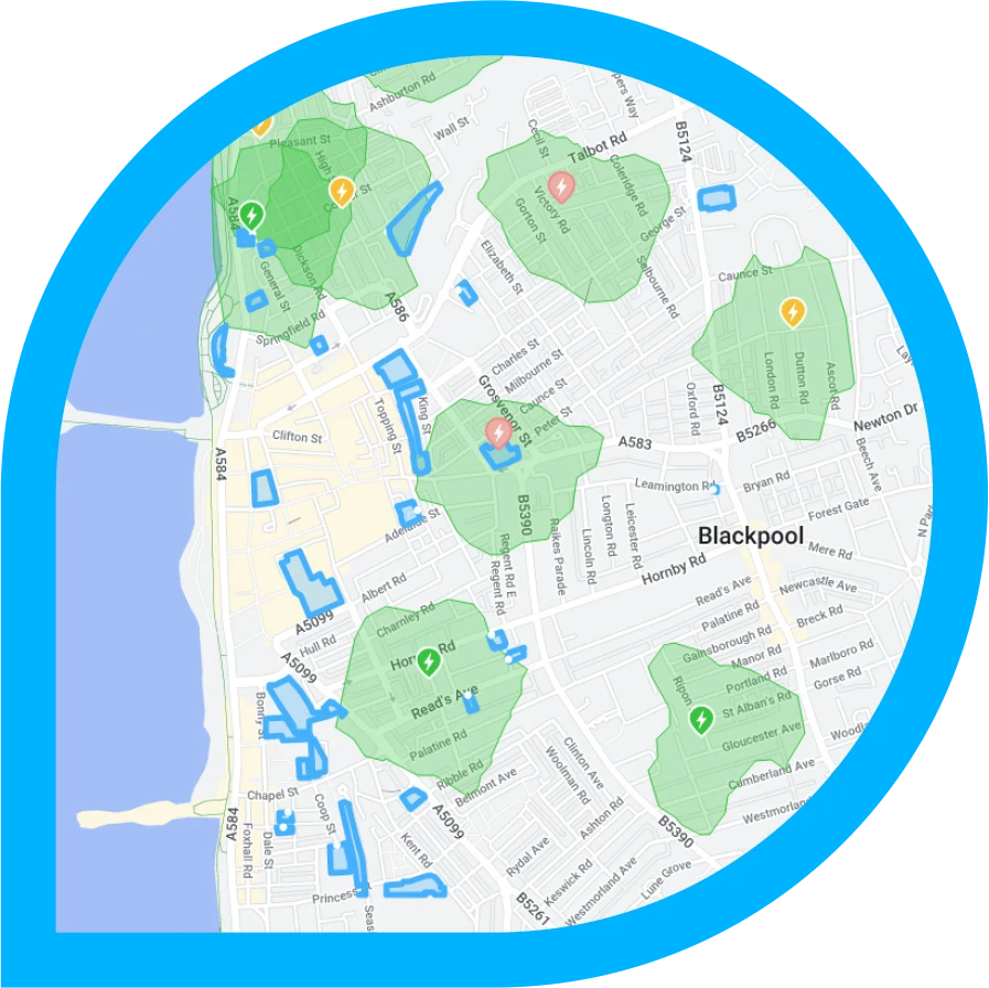
Geographic Analysis
Real-time location data

Data Sources

100k+
Locations Analyzed
Visualize how your charging infrastructure will integrate into real-world environments with our advanced modeling capabilities.

Analysis
Assessment
Planning

blog
Latest ideas and updates
Most CPOs cannot answer the only question that matters. We think we can.
Stefan Furlan, CEO, Dodona
One of your sites went quiet in April. You found out in May.
Then the real work started. Zapmap, to see whether anyone had built nearby. A news search, in case there was a press release. Two competitor apps, to check their tariffs. A spreadsheet to hold it together. By the time you had an answer you believed, the quarter had closed and the site had been quiet for two months.
If you run a charging network, I suspect you have lived some version of that. I have watched charge point operators describe it, in almost identical terms, in nearly every conversation we have had this year.
The only question that matters
Three weeks of work, and at the end of it you still would not bet the quarter on the answer.
The question is just: why.
Everything follows from it. You cannot price against a competitor you have not noticed. You cannot fix a fault you have spent a month calling a demand problem. You cannot defend a site to a board, or to a lender, without knowing what actually moved.
And here is the thing that has been true for as long as this industry has existed.
When the reason sits inside your fence, you can answer it. Your systems are built for exactly that and they are good at it. Sessions, energy delivered, faults, revenue per charger, down to the connector.
When the reason sits outside your fence, you cannot. Not slowly, not approximately. You cannot.
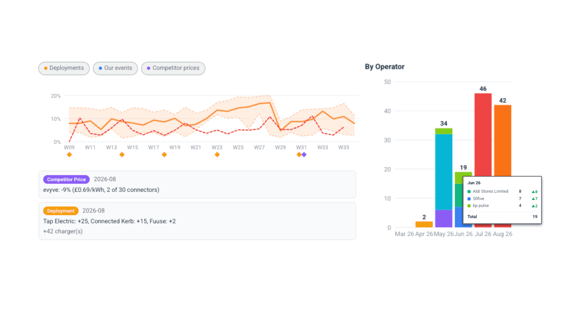
Twelve new bays opened four hundred metres away. A rival dropped its tariff by seventeen percent. The whole local area dipped because the retail park spent six weeks resurfacing its car park. Nothing in your data will tell you any of that, and all three will show up as your site underperforming.
There are five families of cause and your own data sees one of them clearly. We wrote up the full set in a separate diagnostic guide, so I will not repeat it here.
Why this matters more than it did
None of the above is new. What has changed is what the market pays for.
Strategy& found this year that utilisation and asset productivity now sit among the top priorities for almost sixty percent of European operators. The capital coming into the sector has changed shape too. The large financings announced by European operators since the start of 2025 have arrived overwhelmingly as debt and green loan facilities rather than equity, and debt underwrites performance in a way equity never had to.
At the same time, Zapmap and the Green Finance Institute put UK ultra-rapid utilisation at 12.8 percent in the fourth quarter of 2025, against 12.4 percent a year earlier, while ultra-rapid capacity grew forty percent over the same period. Zapmap reads that as resilience, and they have a fair case. I read it as a flat line on revenue per charger during a period of heavy investment.
Building is not finished and will not be for years. But the returns question has moved. For most CPOs it is no longer only where to build next. It is whether the assets already in the ground are doing what they were underwritten to do. Which takes you straight back to why.
Every piece of the answer exists. Nothing joins them.
Here is what I find odd about our industry. Almost every input needed to answer that question already exists somewhere.
Your CPMS holds your sessions. A monitoring tool holds your faults. A mapping service holds who is where. Somebody's press release holds the price change. A planning tool holds the traffic and the demographics.
None of them are joined. So the joining gets done by a person, manually, in a spreadsheet, after the fact, for the handful of sites somebody had time to look at. Which is exactly why it happens monthly rather than daily, and why it stops entirely in a busy week.
Where our data comes from
I will be short about this, because it is the part of the business we guard most closely.
Dodona has spent years building what we believe is the most complete and most accurate picture of the charging market that exists. Every public charger, who runs it, what it charges, how heavily it is used, and the traffic, demographics, vehicle parc, demand conditions around it and so much more. It is why operators come to us to decide where to build, and it is the reason our site assessments still hold up once the site is live.
Until this year, all of that pointed forwards. It answered one question. Where should we build next.
This year we pointed it backwards, at the assets already in the ground.
The same picture that tells you a site is worth building tells you, once it is live, why it is not performing. Same data, second question. As far as I can tell, nobody had asked it.
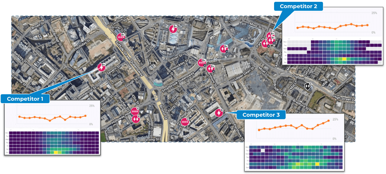
Charger by charger across one city catchment. Not a network average, and not our own estate.
What we built
Network Optimisation is the result. It is the operating layer for a network that is already live, and it sits above the systems you run rather than replacing any of them.
It watches your network and the market around it. It tells you when something moves, on either side. It ranks what it finds by the annualised revenue at stake rather than by a percentage, so the list arrives in the order a commercial owner would choose. Then it holds each action open until somebody can show it worked, against the number that was forecast when the action was created.
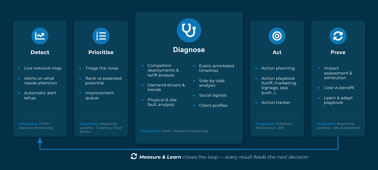
Detect, prioritise, diagnose, act, prove. The last step is the one that makes the next decision better.
That last part is the one I would defend hardest. Plenty of tools will tell you something is wrong. Very few will tell you whether the fix paid for itself, and without that the loop never closes and nothing compounds.
What to actually do once you know the cause is a separate question, and a practical one. We wrote up twenty three of the moves operators actually use, from tariff changes to signage to switching a site off for a period.
What surprised us
Every operator we showed this to already had dashboards. Good ones. In a couple of cases more granular than ours, built on their own session data and watched every day.
Not one of them had any view of what was happening outside their own estate.
That reframed what we were building. The gap was never reporting. CPOs report on themselves perfectly well. The gap is that the reporting stops at the fence, and the reason a site underperforms is usually on the other side of it.
If any of this sounds familiar
We are running Network Optimisation with a small group of design partners now, and opening it more widely after that.
If you run a charging network and the first paragraph sounded like your last quarter, I would like to talk to you.
You can put time straight in my calendar here.
Stefan
Read More

23 ways CPOs fix underperforming sites: the remedy playbook
Article 2 of 2. Companion piece: Why chargers underperform
Profitability is the slide every charging board deck now ends on. Ask most operators how they get there, and the answer involves growth: more sites, more hardware, economy of scale.
The market has started moving the other way. Zapmap noted in mid-2026 that operators are shifting focus toward utilisation rather than deployment, and that poorly performing chargers are being pulled out of public use. Their utilisation work with the Green Finance Institute found usage rates holding within a narrow band through 2025 while the network grew 13%. Adding chargers is no longer the same thing as adding revenue.
So the return has to come from the estate you already own. Sites pulling half of what they should. Chargers that look fine on a map and lose money every week.
In our business, we speak with heads of operations and network performance of charge point operators across Europe. We often ask one question: when a site underperforms, what do you do about it?
Twenty-three distinct remedies came out again and again. We decided to organise these into five categories and present them systematically.
Before anything: name the cause
Every operator we speak to does the same thing before lifting a finger. They work out which kind of problem they have, because the fix depends entirely on the cause.
Bucket | The short version |
Demand | Hardware healthy, too few EVs or too little awareness in the catchment |
Physical site & visibility | The site works, drivers cannot find it, reach it or read it |
Technical / uptime & faults | Attempts happening, charges not completing |
Price & competitor activity | A rival moved, and your volume followed |
Location | Weak since day one, no event explains it |
Our companion guide, Why chargers underperform, works through the symptoms that separate these. The rest of this piece assumes you already know which bucket you are in.
The lever menu
Shares below show roughly how many of the operators we spoke with raised each remedy. We have rounded them, and we name no operator, because several of these remedies came from a small number of teams who would be identifiable otherwise.
Pricing
The most-discussed category, at around a quarter of everything raised.
Remedy | Share of operators | When it fits | Check it worked |
Cut price or run a targeted discount (network, hub or socket level) | 75% | A rival cut their tariff, or a healthy site with room above the cost floor | Utilisation and kWh against control sites; margin per kWh stays above floor |
Hold and do nothing through a short competitor promotion | 65% | The promotion is time-boxed, and your network is sticky enough to ride it out | Does utilisation recover on its own once the promotion ends? |
Time-of-day pricing to move demand into quiet windows | 35% | Sharp peak and trough pattern with spare capacity off-peak | Off-peak session growth without eroding peak margin |
Price is the first reflex almost everywhere. The more interesting position, raised nearly as often, is knowing when to sit on your hands. Several operators described watching a rival run a time-boxed deal nearby, holding their own tariff, and waiting for volume to come back. Cutting in response starts a race nobody wins.
Some teams also cap how far they will discount, because a tariff change carries operational cost of its own once you count reboots and comms. Before you move, benchmark: Zapmap put the July 2026 weighted average pay-as-you-go price at 54p/kWh up to 49kW and 80p/kWh at 50kW and above. If you sit below market and still lose volume, price is not your problem.
Marketing & demand
Around a quarter of everything raised, and the category operators reach for fastest once the hardware checks out.
Remedy | Share of operators | When it fits | Check it worked |
Hyperlocal promotion in a tight radius around the site | 55% | Site is healthy, but nobody local knows it exists | New users inside the radius; session uplift against baseline |
Flyer and leaflet drops | 45% | Residential areas with little off-street parking, or a brand new site | Sessions and new users in the weeks after the drop |
Fleet and B2B deals for quiet windows | 35% | Consistent dead hours plus depots nearby | Contracted off-peak volume; blended site utilisation |
App push to drivers near the site | 10% | You have an app user base in the catchment | Push-to-session conversion against a hold-out group |
Win-back after a failed charge or a fix | 10% | Failed-charge events, or a site you have just repaired | Return rate of contacted users |
One rule governs this whole category: never market a site you have not verified. J.D. Power's 2025 US study found 14% of EV owners visited a charger and left without charging. Spending to send new drivers into that experience buys you churn at full price.
The win-back move deserves more attention than its share suggests. Operators describe EV drivers as fickle, so a plain apology after a failed session, plus a nudge to lapsed users once the site works again, recovers sessions for close to nothing. Very few teams run it as a process.
Resident-engagement work on foot comes up from operators running kerbside estates, where the driver has no driveway and no alternative. With on-street charger numbers growing 18% year on year through H1 2026 according to Zapmap, more operators will need this muscle than currently have it.
Physical site & visibility
The smallest category by share, at roughly one mention in eight, and the one with the cheapest wins in it.
Remedy | Share of operators | When it fits | Check it worked |
Signage and wayfinding | 35% | Healthy site that drivers cannot find | Session uplift; first-time-user share |
Dedicated EV bay plus anti-blocking enforcement | 20% | ICEing, bay blocking, overnight squatters | Availability percentage; share of long blockers |
Site visit or manual inspection | 20% | Unexplained drop with a suspected silent fault | Faults found and fixed, logged against the cost of the visit |
Vinyl wrap or on-charger branding | 10% | Low visibility in a large car park | Sessions and new users after the wrap |
Site visits find real problems. Teams that drive their estates turn up payment screens bleached by sunlight, losing customers with nobody any the wiser. But a person walking a large estate is the most expensive diagnostic tool you own. Keep it rare, send it with a hypothesis, and log what each visit cost against what it found. Some operators are piloting crowdsourced field checks as a cheaper way to get eyes across an estate.
Technical / uptime & faults
Roughly one mention in five, and the category where the cheapest remedies live.
Remedy | Share of operators | When it fits | Check it worked |
Triggered remediation workflow with a verify step | 35% | Any confirmed issue that has a defined response | Share of issues resolved without human handling; post-action utilisation |
Remote reset, reactive and preventive | 20% | Status faults, or a known quirk on that charger type | Fault recurrence rate; first-time success percentage |
Hardware repair: water ingress, drainage, screens, comms | 20% | Physical faults after storms or sun exposure | Uptime; contactless payment share |
Escalate to the DNO, CPMS or charger vendor | 20% | Root cause outside your control, such as grid overvoltage tripping units | Trip incidents; time to resolution |
Firmware selection by charger type | 10% | A hardware type where versions fail at different rates | First-time success by firmware version |
Crowdsourced field checks | 10% | Cheap eyes across a large estate | Cost per verified issue against manual visits |
This category has changed status. It used to be a margin question. Since the Public Charge Point Regulations came into force, a rapid network has to hit 99% reliability as an annual average, reported to the Secretary of State. One secondary source cites a 2025 Monta survey of over 200 UK operator decision-makers finding fewer than 4% already meeting it. Worth verifying at source, but the direction is clear enough: technical remedies now defend a compliance number as well as a margin number.
Strong teams resolve most of this without leaving the office. A remote reset the moment a status fault appears. A restart scheduled around a known quirk for that hardware type. An engineer only once the fault is confirmed physical. And when the cause belongs to someone else, they route the ticket to the DNO or the manufacturer instead of burning their own hours on it.
Firmware selection is the most underused item on this list. A few teams use a third-party service that tells them which firmware version performs best for a given charger type, then deploy accordingly. Most operators run whatever shipped.
Portfolio / strategic
Roughly one mention in five, and the category that decides whether any of the others compound.
Remedy | Share of operators | When it fits | Check it worked |
Feed what you learn back into site selection | 55% | A repeating pattern explains your good and bad sites | Forecast accuracy against actuals on the next deployments |
Decommission or divest chronic losers | 20% | Still weak after every reasonable fix | Portfolio margin; return on the freed capex |
Set utilisation targets and rank the outliers | 20% | Always, as the cadence that starts everything else | Number of outliers actioned; movement against target |
Relocate the charger | 10% | Wrong location, permanent obstruction, contract permitting | Utilisation at the new site against the old |
Switch off temporarily, with a reminder to switch back on | 10% | Known disruption such as streetworks | Avoided dead-charger losses; on-time reactivation |
The most valuable item here is the one operators mention most and formalise least. What you learn fixing one site should decide where you build the next. A rival's strong site nearby is either a signal to follow or a reason to stay away, and the answer sits in your own recovery data.
Operators running large mixed estates put the harder version plainly: at some point you stop spending on locations that will never pay back, and you move that capex to the ones that will.
Run it as a loop, not a rescue
Every strong operator describes some version of the same cycle.
A site slips. An alert flags it.
You diagnose the cause.
You pick the remedy that will most likely fix the cause.
You do it.
You go back and check whether utilisation recovered.
You analyse, learn, and capture the lesson for next time.
Step five is the one a lot of CPOs skip. Skip it and you never learn which lever works on which kind of site, so next quarter you guess again. Teams that formalise it name the stages: alert, diagnose, plan, in progress, verify. The last stage is where the compounding happens.
A cadence that holds this together, from the operators who run it best:
Weekly: rank sites by the gap against what they should do. Work the top of the list.
Monthly: review the fixes currently running. Did the number move?
Quarterly: count which causes dominated your estate, and update your playbook accordingly.
Where the manual version stops working
Scale breaks this. Plenty of European operators now run estates well past a thousand chargers.
You cannot rank a thousand sites by hand every week. You cannot hold the likely cause of each weak one in your head. And you certainly cannot recall, six weeks later, whether the tariff change at site 412 moved the number or whether the season did.
So the loop degrades into a rescue. Whoever shouts loudest gets attention, the same three sites get fixed twice, and the verify step disappears. Operators with large estates describe some version of this without being asked.
What we built
Dodona Network Optimisation exists for this job.
It ranks every site in your estate by the gap between what it pulls and what it should pull, so you open Monday with a list instead of a hunch. For each weak site, it names the likely cause, whether that is demand, price, a fault or placement, so you know which bucket you are in before you spend. Where it can, it triggers the remedy itself, such as a remote reset off a known fault, then writes the outcome back so you can see whether the action moved the number.
Diagnose, act, verify. Across a thousand chargers, without anyone babysitting the list.
We are opening a beta to a small group of operators, and several networks are already in. Bring your five worst sites, or your own data if you are up for it, and we will rank them live in about ten minutes. Reply to this, and we will find a slot.
Sources
Zapmap and Green Finance Institute, UK charge point utilisation report, 2026
Zapmap Price Index, July 2026, and UK charging infrastructure statistics, H1 2026
J.D. Power, US Electric Vehicle Experience Public Charging Study, 2025
The Public Charge Point Regulations 2023, regulation 7
Monta UK charge point operator survey, 2025
Read More